Last Updated on October 3, 2024 by Ade Aprilia
As a healing coach, I have worked with small business owners to help them release their stories, triumphs, frustrations, and limitations. There is something special about working with small business owners. They are driven by their passion to create something meaningful. They launched their business to live the life they want and do the work they love.
I’ve been there.
The reason I started doing what I do is to have freedom with my time, freedom with my choices, and freedom to create something valuable and design a flexible lifestyle. Now I can help you who also want those with ease.
This is the reason I nurture my clients or those who are interested in my services using well-timed emails. My email list is a place to stay connected to my community.
If you’re anything like me and have all the good intentions of using an email marketing list, you’ll love Flodesk.
(the link is an affiliate link which means I get a commission if you purchase through me, but you’ll get 50% off your first year of Flodesk too)
Try this yourself.
“Use code {ADELIA} to get 50% off your first year of Flodesk”
Doing Flodesk the right way
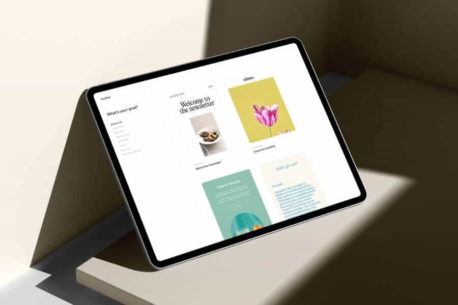
As far as I know, Flodesk is the world’s most intuitive email marketing platform designed to help small businesses grow, nurture, and monetize their lists beautifully.
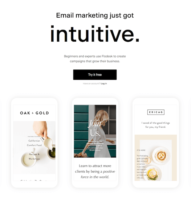
I recently shared a blog post about the 9 reasons why I’m switching my business to Flodesk for email marketing. This switch was probably one of the easiest decisions I’ve made in my business!
Today, I’m sharing what sets Flodesk apart in the email marketing space.
Keep on reading, so you don’t miss out!
If you’re intuitive, you’ll love Flodesk
I’ve always believed in the power of email marketing, but in the past, I would never have imagined that growing my list could be so much fun! I used to feel nervous about getting my newsletter out the door for one key reason: I failed to build out well-designed emails.
When Flodesk came out, I thought, “Wow, finally an email marketing platform that’s allowing us to make emails look good! Flodesk is finally doing this right.”
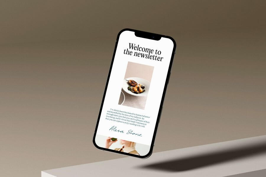
I was in love as I laid eyes on the clean and simple email design templates by Flodesk. From the gorgeous fonts, color palettes, and layouts, I found that creating branded emails to grow my business has never been easier and more visually appealing.
Flodesk gives me such peace of mind knowing that I can strategically target my tribe. Their service allows me to tag email newsletter folks with what they’re interested in. Because in a world of rest, ain’t nobody has time for emails they’re not interested in.
What I love about Flodesk is that it is intuitive and friendly. If you notice, a lot of the other email marketing platforms are very code-friendly or web-safe, so you get a lot of boring designs and fonts that just don’t look pretty. First of all, Flodesk is a visual builder and you don’t need to know HTML code as you experiment your way through creating eye-catching emails. The click-and-drag builder makes it easier than ever to create beautifully branded emails. No coding or design team is required. Flodesk has managed to build a platform that’s more intuitive than others.
It was also incredibly simple to deliver my lead magnet using Flodesk. I simply uploaded my free audio guide to releasing guilt and shame right inside the email and linked it to a custom download button. My subscribers can easily get their hands on what I promised them when they signed up.
And I really love the analytics overview for each email. It’s super informative and yet easy to understand—giving you insights that can improve your marketing performance.
Using Flodesk has made creating emails a gratifying experience for me. Who said power couldn’t be simple?
So, I’m glad Flodesk has joined the ranks to help creatives and businesses grow their list the fun way!
Flodesk is changing the game for me and I am beside myself with excitement. So much so, that I just had to share this with you because I think you’ll love it too.
A fun, new way to engage users
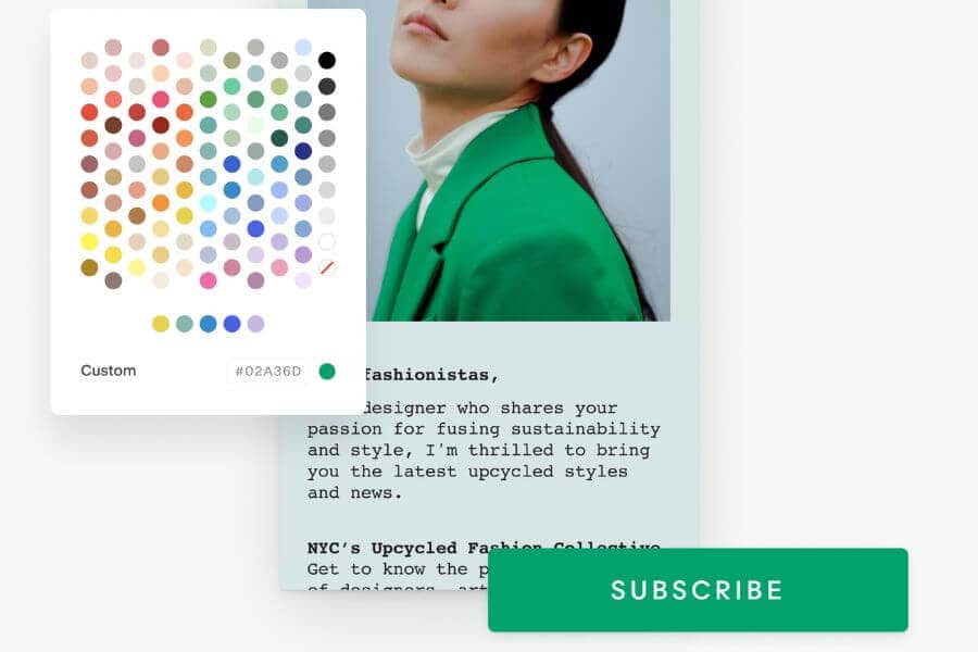
Flodesk makes it easy to design emails people love to get with stunning templates and the world’s most intuitive builder. If you care about your tribe as much as I do, consider growing your list with landing pages, pop-ups, and embedded forms, make money while you sleep with workflow automation, and run email marketing like a pro with advanced segmentation and robust analytics.
Even though a lot of people prefer receiving emails that are text-based because it feels more organic and natural as if you’re talking to a friend, it doesn’t apply to my general clients. I attract people who also love beauty.
Flodesk’s dashboard has been designed with creative, visual people in mind, and is very intuitive to use. I’ve found that other email marketing platforms can seem quite difficult and technical to use, and the amount of information on each page can be overwhelming. Meanwhile, Flodesk is sleek and simple, and their pre-designed templates (that you can tweak to your heart’s content!) are created in a drag-and-drop editor and look amazing on desktop and mobile.
Flodesk has a library of gorgeous, strategically designed templates that are easily customizable to match your brand’s look and feel. Templates get a bad rap sometimes, but I think that’s a bit unfair. With Flodesk, templates are such a gift! We’re able to give a super-tailored and personalized newsletter.
You can play with the following types of blocks:
- Logo
- Link bar
- Image
- Layouts
- Instagram Feed
- Text
- Button
- Divider Line
- Spacer
- And so much more!
Most noteworthy, I can compose beautiful emails that serve my tribe in less than 10 minutes. It was completely painless and it just worked like magic.
I love that Flodesk is so user-friendly. Flodesk automatically saves your changes and has undo and redo buttons so you can quickly go back a few steps if you’ve made a mistake. If you have an OCD behavior like I used to have (it’s already released), you can literally part ways to what seems like endless clicking to save your template.
I’m content because now I can design emails people actually love to get in their inbox — and of course, look great on any device.
When we send email newsletters, we want our audience to feel the love and the effort we are pouring into our communication with them. Flodesk makes my creative brain happy and my audience will be able to have a better connection with my content.
Let’s have fun with forms!
Flodesk makes it easy to build your subscriber list. It has several form options for collecting contact information from your website.
As we all know, if you don’t already have a freebie opt-in on your website, you have no good way of collecting potential clients’ contact information. Without their contact information, you have no way to support them, nurture them, and grow your value ladder.
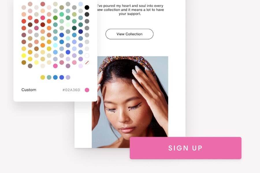
Flodesk makes it easy to grow your email list because it provides us with online forms. Forms let us collect valuable information to market our small business directly in the comfort of subscribers’ inboxes.
If you click on the Forms tab, you can see all your forms at a glance.
You don’t even need your own website to start building an email list with Flodesk. You can create sign-up form landing pages straight from within Flodesk, or even your own link in bio page to use as your Instagram profile link.
Of course, if you do have your own website, Flodesk makes it easy to connect to any website platform too.
With Flodesk Forms, we can choose from popups, embedded inline, fully hosted full-page forms, and link in bio. I can easily customize it to match my brand’s look and feel, hit publish, and share it anywhere—from my website to my favorite social media page.
Popup forms
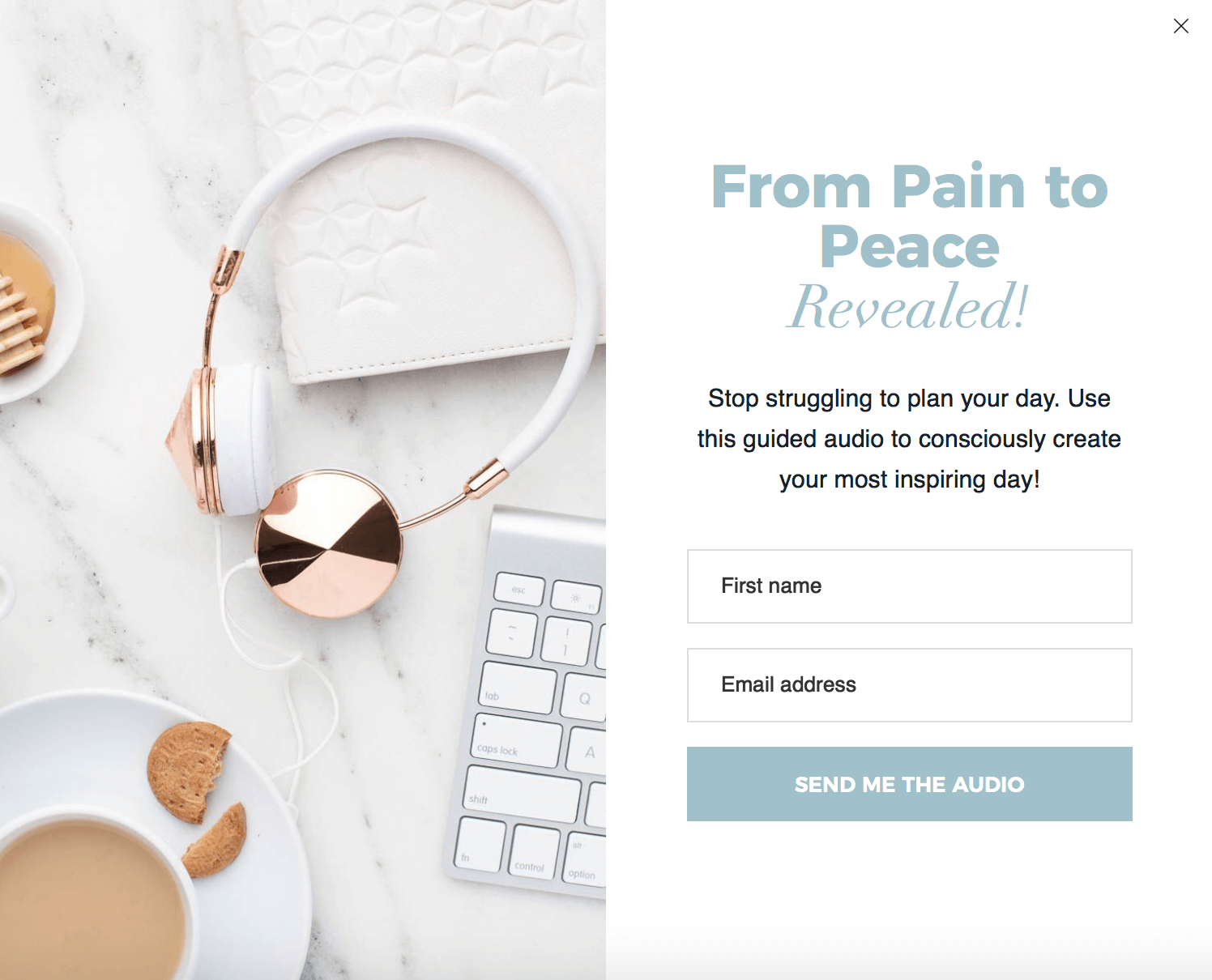
I use popups to gather information, build my newsletter subscriber base, and promote freebies like releasing audio, so I can build an engaged community around my service. It appears strategically on my webpage and I make sure it doesn’t overly disturb the browsing experience.
Flodesk Popup Forms are fully customizable and are super easy to embed on your website. Within minutes, I could build the subscription page on my website—which surprisingly looks great on desktop and mobile. I created my first opt-in form and customized it to match my brand, pasted the HTML into my blog and website, and directed my audience to download my lead magnet. This was so easy and liberating.
I’m slightly in love with the popup on my website.
Inline forms
I also use an inline form to get my audience excited about my special offer or newsletter content right from my website. But while popups appear over other content, inline forms are embedded into the web page itself like this:
READY TO IMPROVE YOUR MENTAL HEALTH?
Check out my free guided audio to get started on how to release emotions painlessly on the spot!

This inline form allows my audience to choose what resource they’re most interested in.
Link in bio
You can also start growing your list with a stunning link in bio that captures subscribers right from your social profiles.
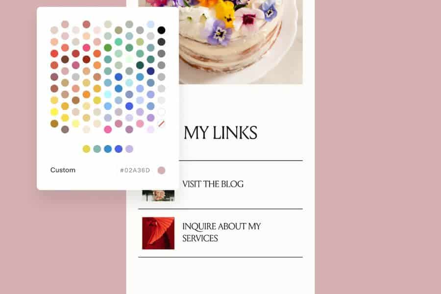
A Flodesk Link in bio is a shareable form that lets you turn your social media followers into subscribers by offering your social media followers unique content, product codes, and freebies.
What I like about link in bio forms is we can host our most important shareable links and email list opt-in forms all in one place. It creates a link landing page that showcases up to six links, plus an opt-in form, and replaces Linktree and centralizing your resources.
And of course, this is another code-free solution. You can simply select a template, customize it, and add the link to your social media bio. Flodesk has a library of gorgeous, strategically designed templates that are easily customizable to match your brand’s look and feel. Keep everything 100% on-brand.
Now, watch as your subscriber numbers climb faster than ever!
Video Forms
Video forms are a new opt-in form type to help you grow your list even faster by leveraging the persuasive power of video.
With the new video forms, you can embed a YouTube or Vimeo video directly on the opt-in form, introducing yourself to connect to your audience in a new way,
creating a personal connection with your audience by using video to deepen the experience (explain products, share testimonials, or deliver a call-to-action), encouraging visitors to subscribe, and making your form look unique with a new set of background shapes, colors, and design elements proprietary to Flodesk.
Spinner Forms
Spinner Forms are a new popup opt-in form type to help you grow your list even faster. They feature a spin wheel and provide a fun, interactive way to incentivize visitors to become subscribers. The gamified nature makes signing up fun and exciting, which can significantly increase completion rates.
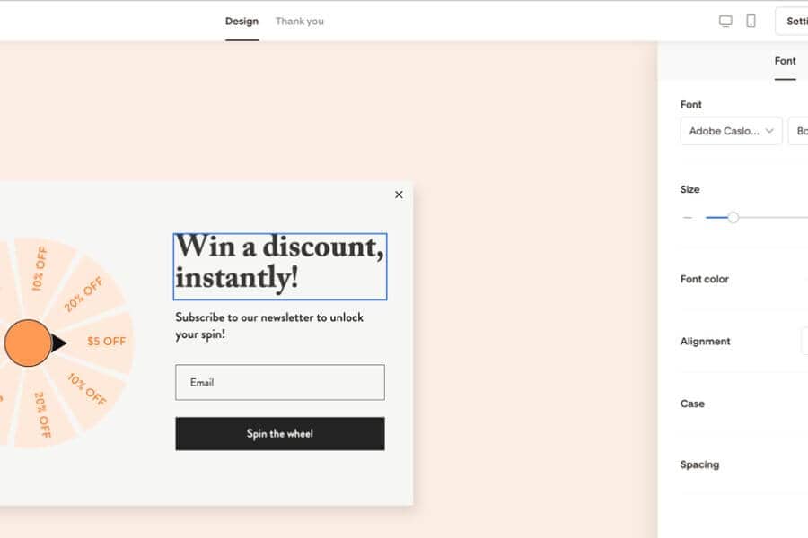
I haven’t had the opportunity to experiment with this new feature but I’m sure spinner forms create a memorable experience that sets the brand apart. The anticipation of winning encourages more opt-ins
Countdown Forms
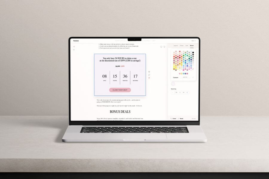
Countdown timer forms are a new opt-in form type featuring a fixed countdown timer, driving urgency, and with that, driving visitors to act quickly before time runs out and leading to higher conversions! The fixed countdown timer allows you to set the timer’s timezone, end date, and end time.
I’m very excited about this feature because I remember I used another app to encourage early bird opt-ins for product launches. And now Flodesk has this, it makes everything easier to create a festive limited-time offer.
As a small business, we may have a limited marketing budget. With effective, time-saving online forms that are easy to roll out in mere moments, we can amp up our sales and marketing without breaking a sweat.
And with Flodesk, creating beautiful forms just got easier! Flodesk has simplified the process and put the power back into your hands.
Selling made simple with Flodesk
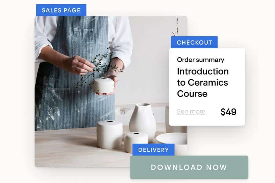
Ready to make sales? Flodesk Checkout helps you monetize with e-commerce blocks, sales pages, upsells, instant deliveries, and unlimited transactions—all seamlessly connected from the start.
I make money in my sleep (literally) with Flodesk Checkout. Flodesk Checkout enables members to sell physical or digital products through stunning, customizable, easy setup of beautiful and high-converting sales pages. It maximizes sales with best-practice tactics like upsells and discount codes and simplifies product sales without the need for an additional website or sales platform. It offers a tailored and branded shopping experience that is easy for you to create and hyper-optimized for making sales.
Checkouts are easy to use and customizable, creating a beautiful experience for both the user and the visitor. You can do:
- Digital product sales – Sell e-books, online courses, digital downloads, and more directly through a customizable storefront, without needing a separate website
- Physical product sales – Offer merchandise and physical products with easy setup and payment processing, all in a beautiful storefront
- Service bookings – Use checkouts to sell consulting sessions, workshops, or other services while integrating upsells to boost conversions
You don’t need to believe anything I said. Try it yourself and prove it.
One monthly price, unlimited subscribers
I feel that other platforms punish you for growing your list. The more subscribers you have, the more you pay each month. As your list of email subscribers grows, the price you pay for software like Mailchimp or Convertkit goes up exponentially.
What makes Flodesk different?
Unlike competitors, Flodesk doesn’t penalize you for growing your list. With Flodesk, you’ll never have to worry about how many subscribers are on your list! Flodesk doesn’t charge based on the size of your audience. I love that this platform doesn’t raise your monthly fee as you grow your list. That means that you can get to growing your list, no matter where you are in your journey. You could have 1,000 or 100,000, and you’d still be paying the same!
Therefore, I am grateful to support this company because they care about us. And I’m sharing my link with you for everyone’s highest and best good.
I know this is going to be a game-changer to grow your email list. And Flodesk got your back. Prove it yourself that Flodesk is the most intuitive email marketing tools for small businesses.
You can get access to Flodesk 50% off your first year of Flodesk.
(the link is an affiliate link which means I get a commission if you purchase through me, but you’ll get 50% off your first year of Flodesk too)
“Use code {ADELIA} to get 50% off your first year of Flodesk”
Have I convinced you yet?
Well, don’t take my word for it. Take it for checking.
Just sign up and see for a free trial of one month now. No credit card. No commitment. Only love.
SAVE THIS PIN!
Did you find this post useful, inspiring? Save THIS PIN to your board on Pinterest!


Leave a Reply